Back to Dude Intelligence for Education Main Menu
Trends allow you to have a historical view of performance to understand your teams' improvement over time. You are able to drill down on specific trends to gain a greater understanding of your teams' performance.
This data updates every month and includes 3 calendar years of data in addition to the current year to the end of the previous month. For example, if you are viewing trends in March 2017, you will see all data from the calendar years of 2014, 2015, and 2016, along with the data from January and February of 2017.
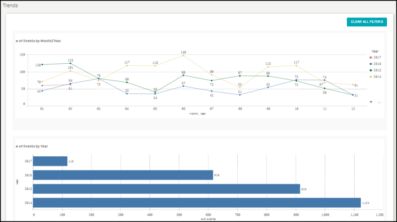
- You can click on a line within a Trend to filter the data on all the trend graphs according to that line.
- To download an image of the graph, click on the download icon (
 ).
). - To expand the graph you are viewing, click on the fullscreen icon (
 ).
). - To export your KPI data into an Excel spreadsheet, click on the Excel icon (
 ). *Note: This will only export the data, not the graphs.
Trends
This graph displays the number of Approved and Activated Events each month for a given calendar year. You are able to compare different years by looking at an alternate line on the graph.
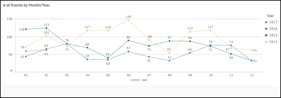
This graph displays the number of Approved and Activated Events for a given calendar year.

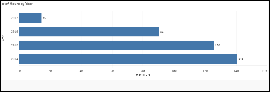
This graph displays the number of hours for Approved and Activated Events each month for a given calendar year. You are able to compare different years by looking at an alternate line on the graph.

This graph displays the number of hours for Approved and Activated Events for a given calendar year.
This graph displays the average number of days it took to activate permits each month for a given calendar year. You are able to compare different years by looking at an alternate line on the graph. *Note: A record is only included in the average calculation if it took between 0 and 365 days to activate.
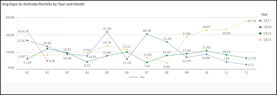
This graph displays the average number of days it took to active permits in a given calendar year. *Note: A record is only included in the average calculation if it took between 0 and 365 days to activate.

This graph displays the percentage of requests entered by Requesters and Site Administrators each month for a given calendar year. You are able to compare different years by looking at an alternate line on the graph.
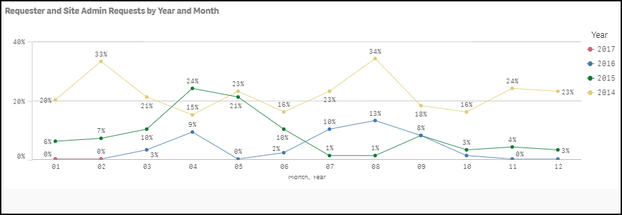
This graph displays the percentage of requests entered by Requesters and Site Administrators for a given calendar year.

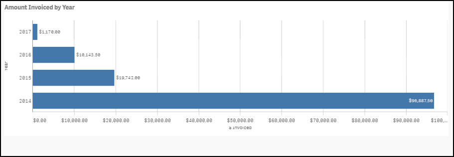
This graph displays the dollar amount invoiced each month for a given calendar year.

This graph displays the dollar amount invoiced for a given calendar year.
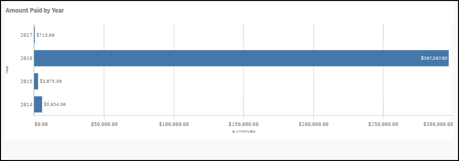
This graph displays the total dollar amount paid on invoices each month for a given calendar year. You are able to compare different years by looking at an alternate line on the graph.

This graph displays the total dollar amount paid on invoices for a given calendar year.
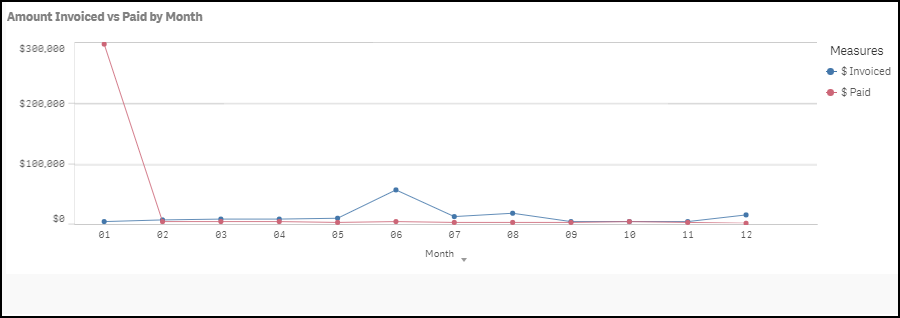
This graph compares the total dollar amount invoiced each month to the dollar amount paid on invoices each month. *Note: This graph combines data from the past 3 calendar years plus the current year.To see this data by year instead of month, click on the Month drop down under the graph and select Year.
